Ideogram V4 Review (2026)
I generated event posters, brand logos, book covers, and movie posters to find out how far Ideogram V4's text accuracy actually goes. Here's what I found.
Ideogram V4 at a Glance
What Is Ideogram V4?
Ideogram is an AI image generator that launched in 2023 with one explicit goal: render text accurately inside images. Version 4 is its most capable model, available directly at ideogram.ai and through third-party hubs like Fotor's AI Image Generator.
Where most image models treat text as an afterthought — Midjourney famously mangles words, DALL-E 3 improved but still stumbles — Ideogram built its architecture around legibility. The result is an AI image generator that can credibly produce event flyers, brand logos, book covers, social media graphics, and signage with readable text on the first try.
I tested V4 through Fotor's hub across four distinct text-heavy use cases. All prompts were designed to stress-test text rendering at different scales and complexity levels.
The Tests
The prompt: A vintage-style event poster for "Southside Jazz & Blues Night" featuring "The Marcus Webb Quartet" performing on "Friday • October 24th," doors at 7pm, at "The Anchor Room, 412 South Main St," tickets "$15 Advance / $20 Door." Navy blue and gold color palette, retro halftone print aesthetic, saxophonist illustration center stage with sunburst rays behind them.
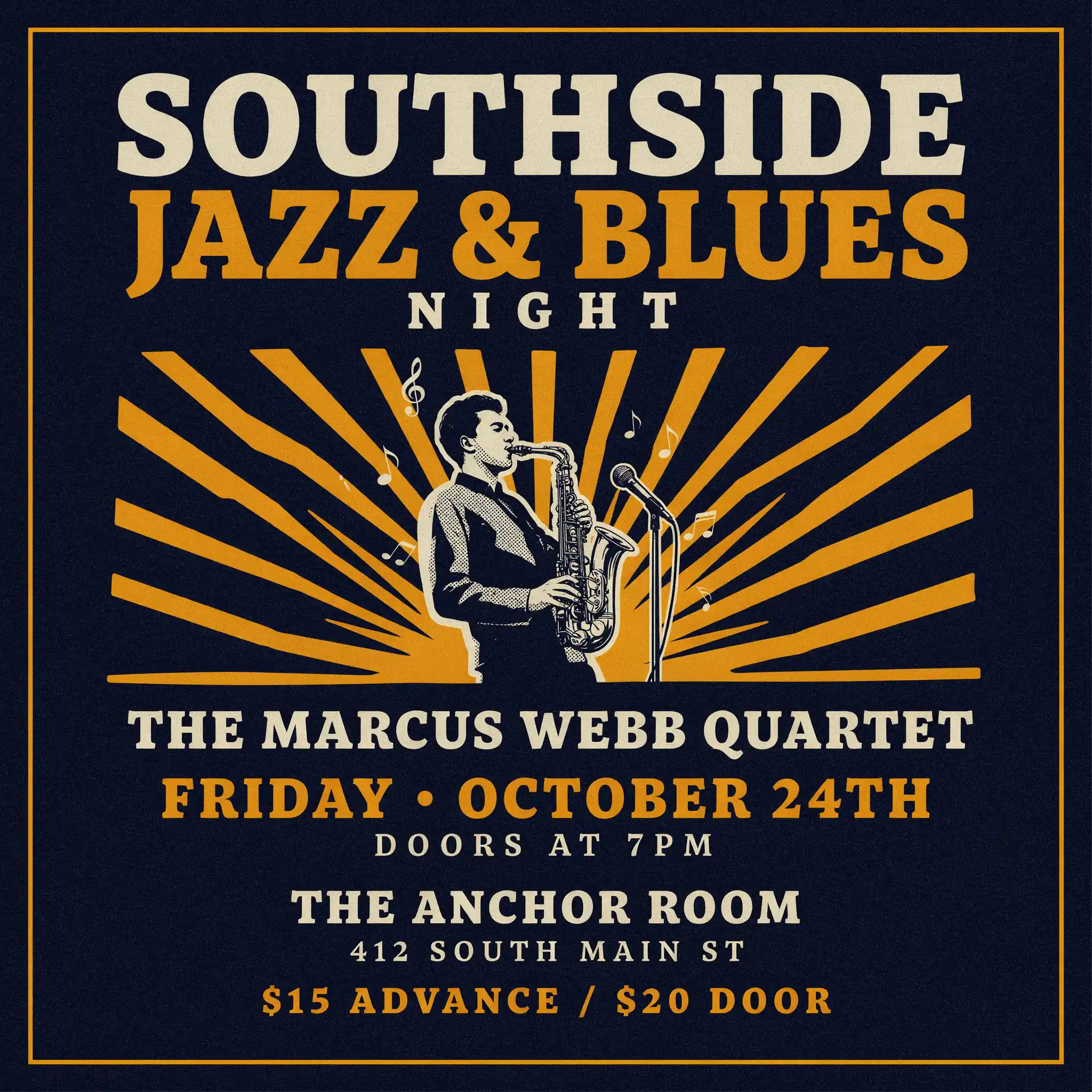
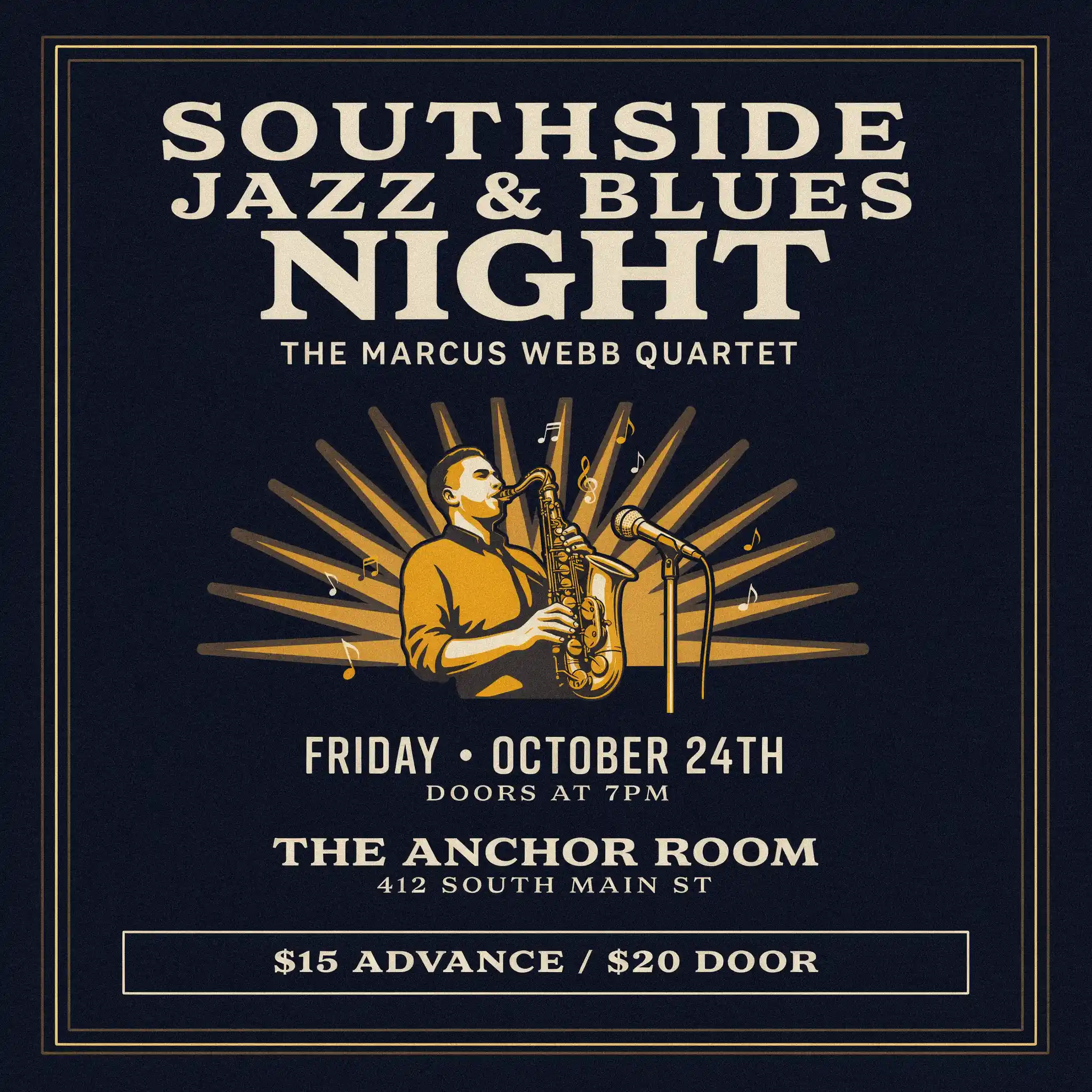
The halftone treatment on Variant 1 is particularly strong — it reads like a real vintage print job, not an AI imitation of one. Variant 2 took a cleaner editorial approach with the band name repositioned above the illustration and the ticket price anchored in a ruled box at the bottom. Either is print-ready as-is.
✓ Text: 7/7 strings correct
The prompt: An elegant restaurant logo for "Magnolia & Oak Kitchen" — cream background, dark forest green and antique gold colors, serif typography, botanical illustration of a magnolia flower with oak leaves, ornate border frame with filigree corner decorations, tagline "Southern Fine Dining Since 1987," and "EST. 1987 • MEMPHIS, TENNESSEE" at the bottom.
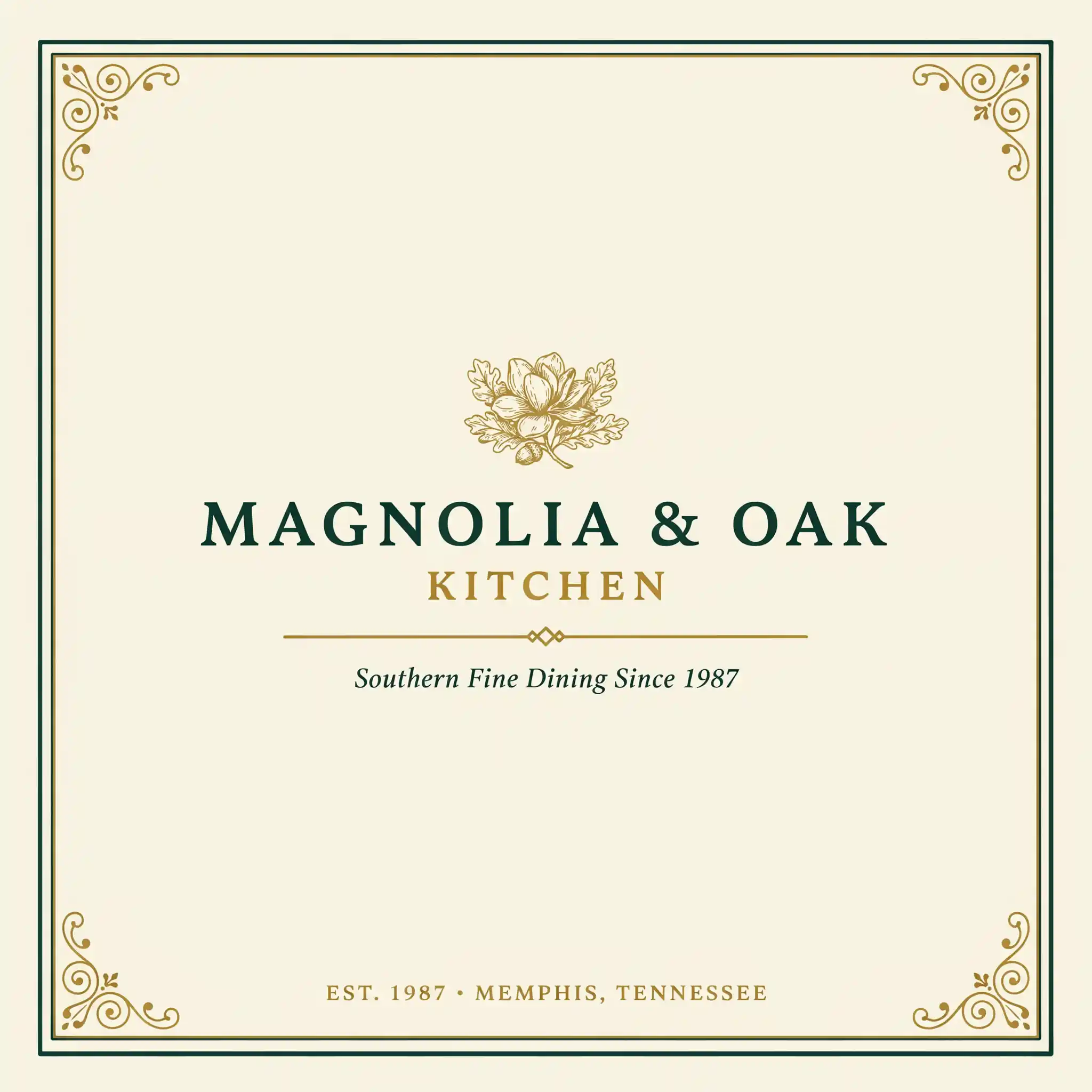
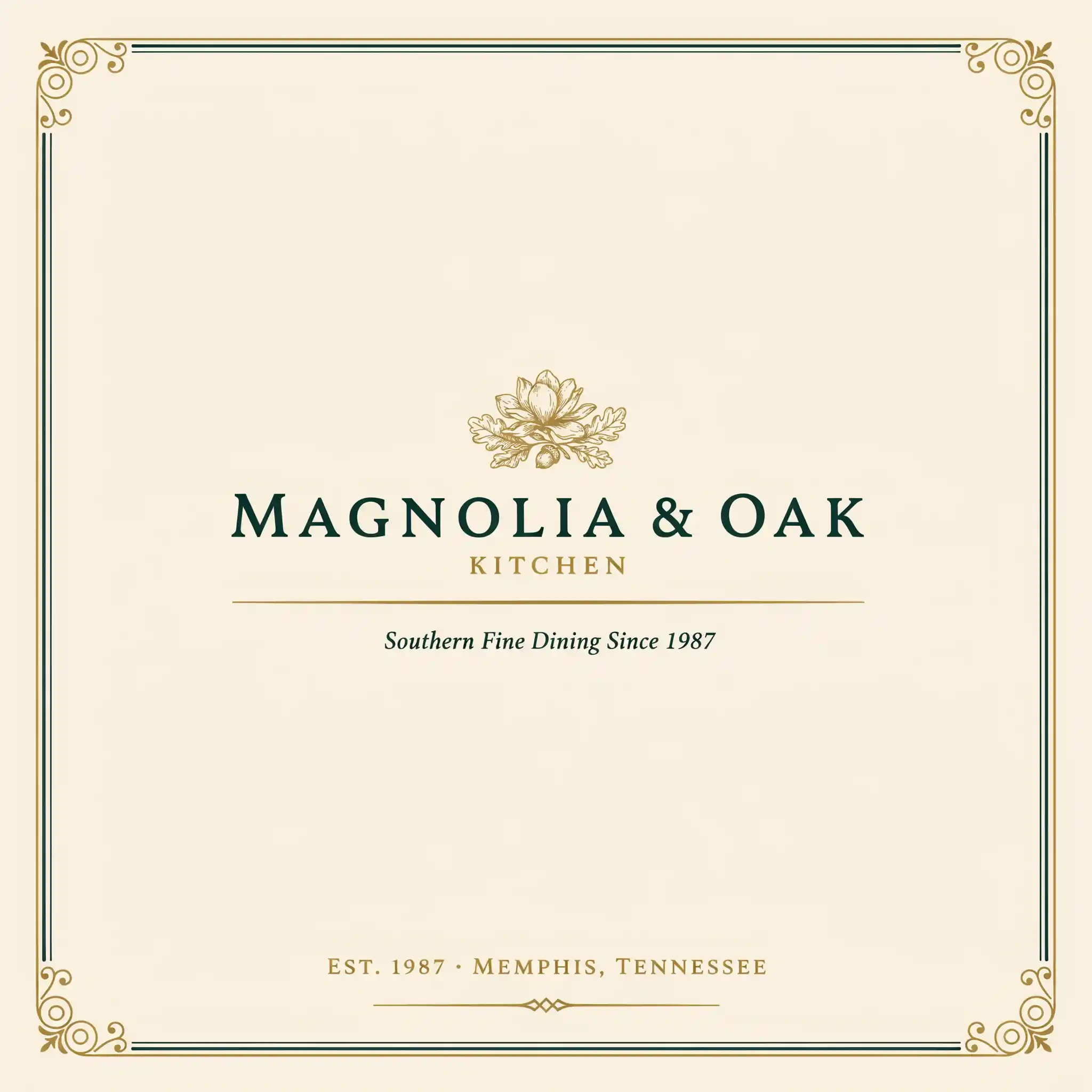
The two variants show Ideogram's range within a single prompt: Variant 1 went for decorative corner flourishes, Variant 2 chose a simpler double-rule frame with a closing ornament at the bottom. Both feel like legitimate brand presentations.
✓ Text: 4/4 strings correct
The prompt: A literary fiction book cover for "What the River Carries" by "Lawrence Quarles," published by "Northwind Press." Moody pre-dawn river scene with mist, a lone wooden rowboat, dark teal and amber tones. Pull quote "A quiet masterpiece." attributed to a major publication. Serif display font for the title, author name in small caps at the bottom.
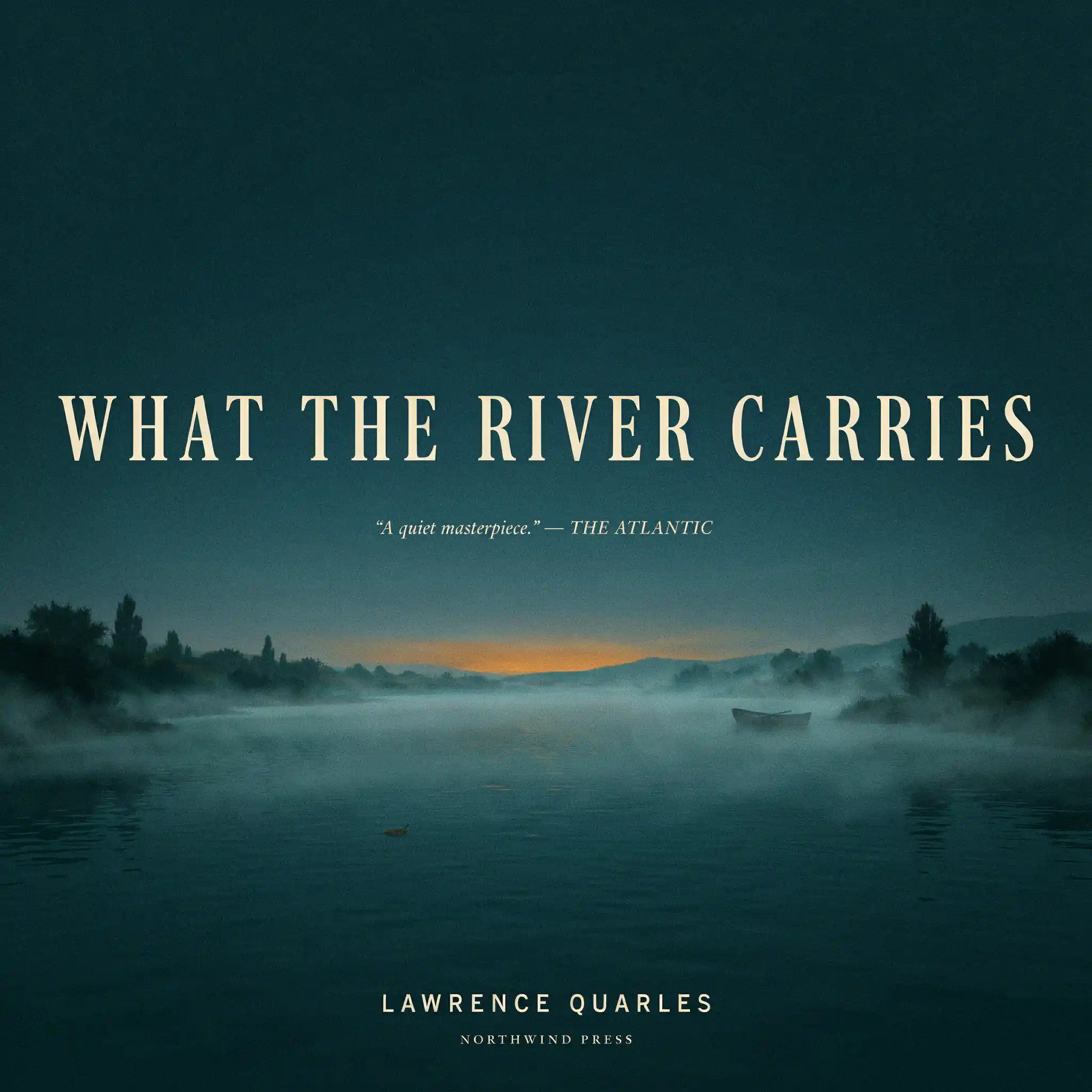
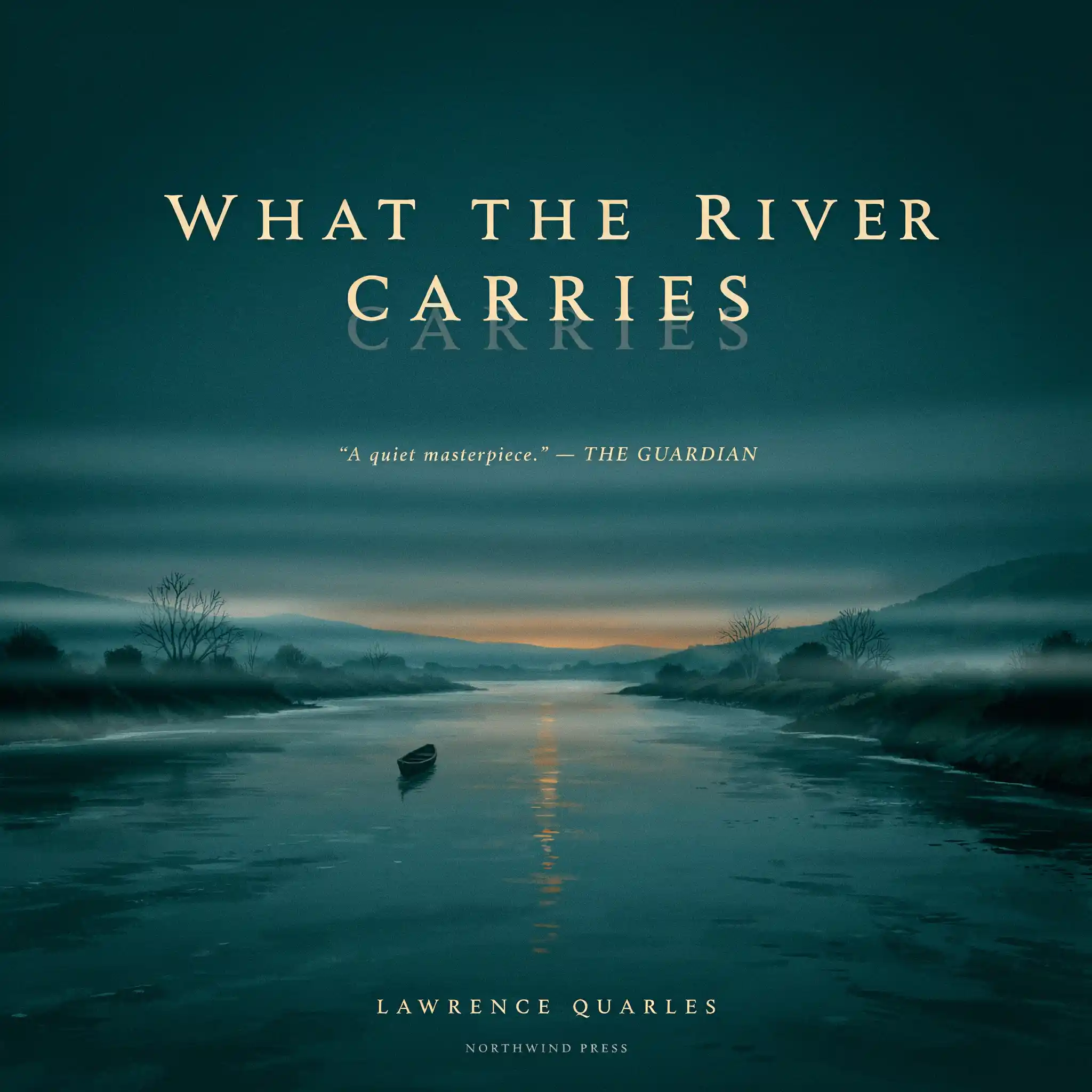
These are the most impressive outputs from the entire test batch. The atmospheric photography and the typography feel cohesive — not pasted on top of each other. Variant 1 in particular looks like it belongs on a Barnes & Noble shelf.
✓ Text: 4/4 strings correct ~ Minor: ghost reflection in V2
The prompt: A dramatic movie poster for "The Last Delta King," a period drama set on the Mississippi River. Starring "James Earl Rivers" and "Della Mae Johnson." Director of Photography, Producer, and production studio credits in the small-print billing block at the bottom — the kind of dense fine print that appears on every theatrical one-sheet.
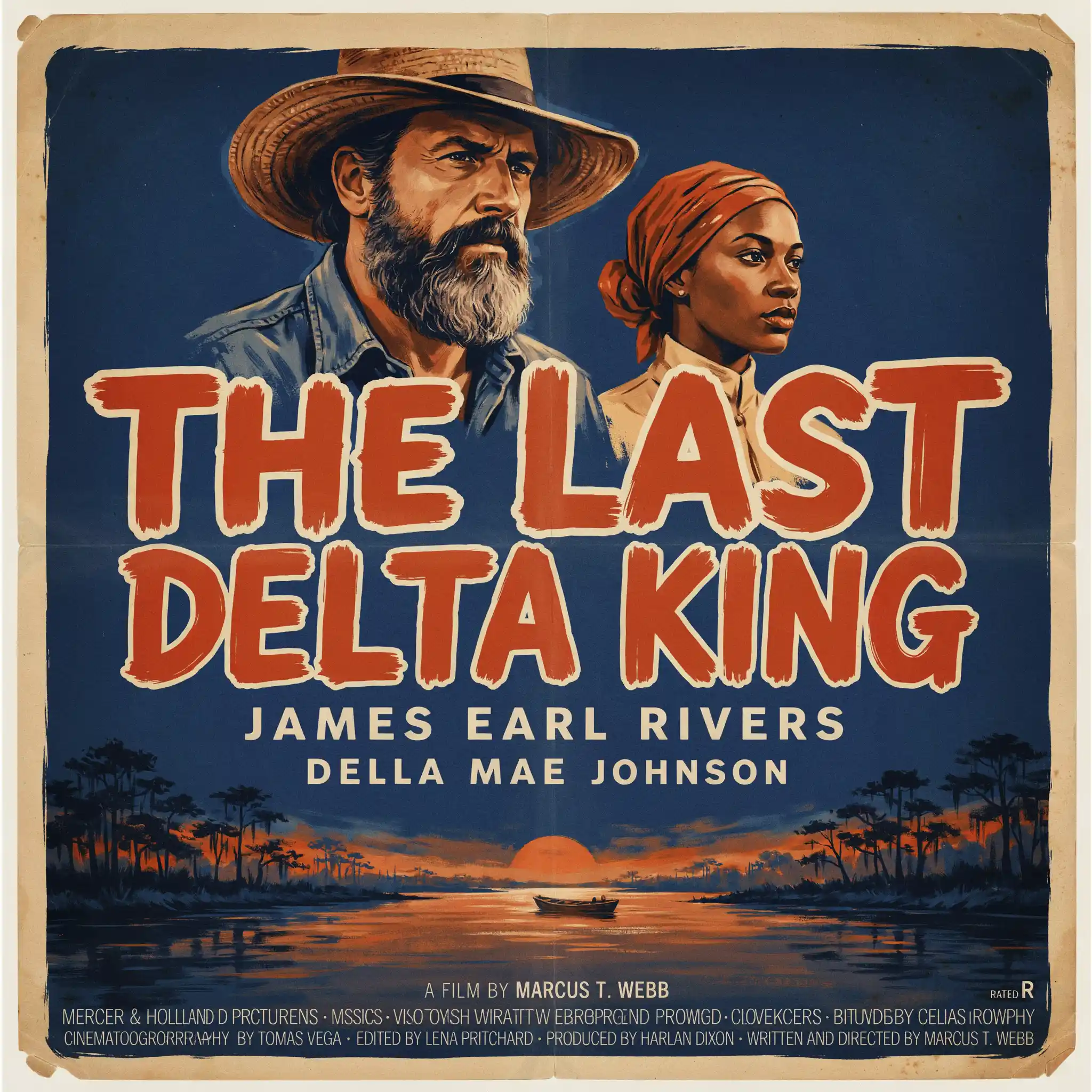
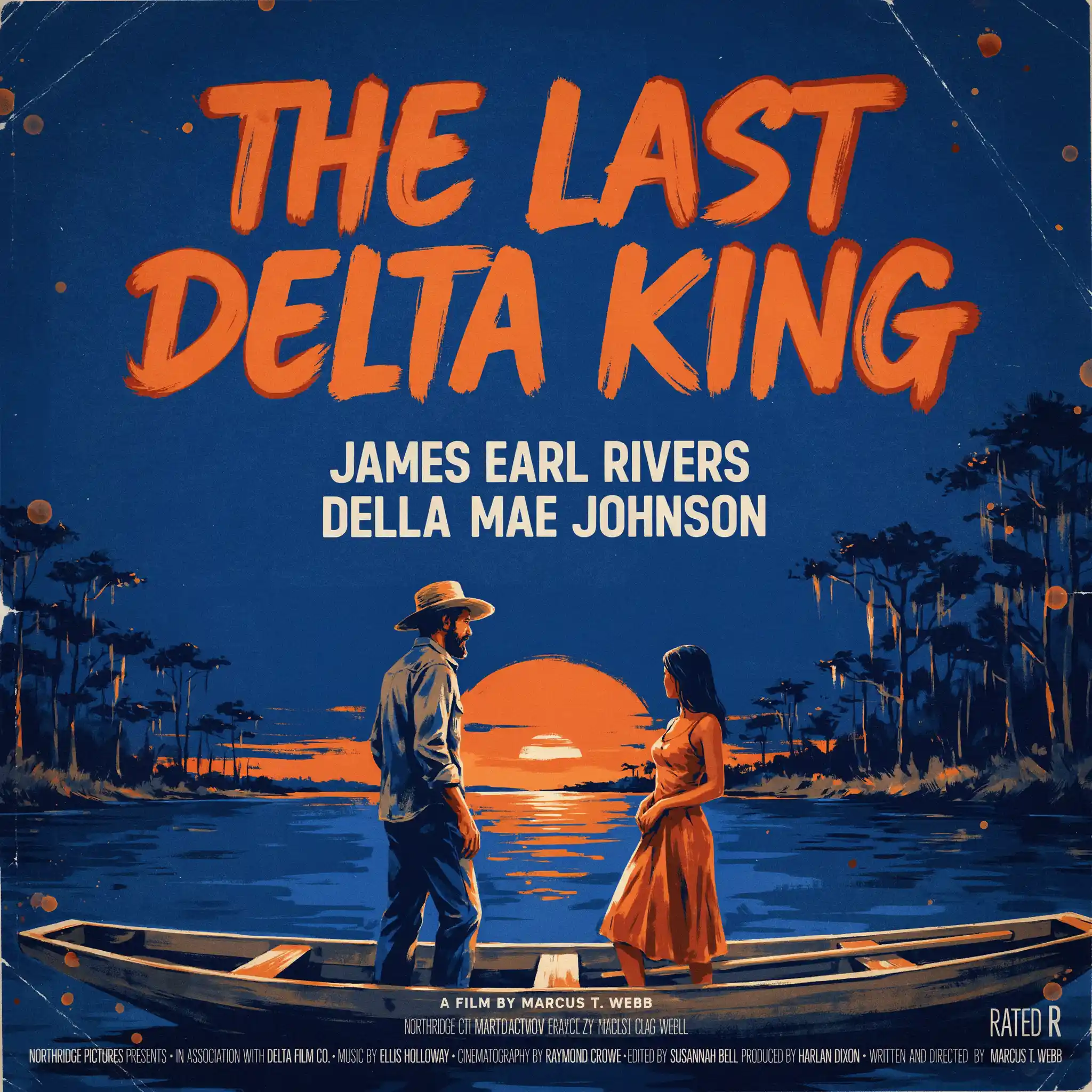
This is worth understanding clearly: the problem is size and density, not text rendering as a general capability. Everything you're supposed to actually read on a movie poster came through perfectly. Only the credits block — which exists at a scale too small to be legible in a thumbnail anyway — failed.
✓ Hero text: 3/3 strings correct ✗ Fine print: garbled
Text Accuracy Summary
| Test | Text Elements | Accuracy |
|---|---|---|
| Jazz & Blues Event Poster | Venue, date, time, price, band name, address (×2 variants) | 100% |
| Restaurant Logo | Brand name, tagline, location, est. year (×2 variants) | 100% |
| Literary Book Cover | Title, author, publisher, pull quote (×2 variants) | ~98% |
| Movie Poster — hero text | Film title, two actor names (×2 variants) | 100% |
| Movie Poster — billing block | Small-print production credits (×2 variants) | ~30% |
Image Quality Beyond Text
Text rendering is Ideogram's calling card, but the image quality around the text is equally strong. The jazz posters captured a convincing vintage halftone print aesthetic. The restaurant logos produced detailed botanical illustration with proportionate, symmetrical filigree work. The book covers delivered atmospheric, painterly photography with realistic lighting. The movie posters — both composition and cinematographic quality — looked like legitimate theatrical marketing material.
In terms of overall image quality, V4 is competitive with Flux.1 Pro and Midjourney V7 for photorealism, and stronger than either for graphic design and typographic work. It won't replace Midjourney for pure artistic outputs, but it holds its own.
Pricing
Watermarked outputs
No V4 access
Ideogram V4 access
No watermarks
Ideogram V4 access
Private generations
Ideogram V4 access
Full API access
Pros and Cons
✓ Pros
- Best-in-class text rendering
- Titles, prices, dates, addresses — all accurate
- Strong graphic design & illustration quality
- Produces multiple distinct variants per prompt
- Competitive image quality overall
- Free tier to evaluate before paying
- Accessible via Fotor hub
✗ Cons
- Fine-print / small-scale text still breaks
- No Discord-based workflow (direct web UI only)
- Not a video tool — images only
- Free tier lacks V4 access
- Less community/inspiration feed than Midjourney
Who Should Use Ideogram V4
Use Ideogram V4 if your output needs readable text: event flyers, business logos, book covers, social media graphics, signage mockups, product labels, or any branded asset where misspelled words would be embarrassing. It's also excellent for photorealistic images and graphic design work where you want the text-to-image pipeline to just work without post-processing fixes.
Skip it if you're producing artistic imagery with no text requirements and prioritize Midjourney's distinctive aesthetic, or if you need video output (Ideogram is images only). For pure artistic generation without text, Midjourney V7 and Flux.1 Pro are also strong choices.
Final Verdict
Ideogram V4 does what it says on the tin, and does it better than any other model on the market. Eight test images across four use cases, and the only failures were in fine-print billing blocks that no one is expected to read in a thumbnail. Every hero text element — the stuff that makes a poster work, a logo legible, or a book cover sell — came through correctly on the first generation.
At $8/month for 400 priority generations, it's also one of the most reasonably priced specialized AI tools available. If you regularly produce any kind of designed-image content, Ideogram V4 belongs in your stack.
Try Ideogram V4 Free
Generate your first images at no cost. V4 access unlocks on the $8/month Basic plan.
Start on Ideogram.ai →Frequently Asked Questions
How good is Ideogram V4 at text?
It's the best AI image generator for text rendering as of 2026. In 8 test images — posters, logos, book covers, movie posters — all primary display text rendered correctly. Only fine-print credits in movie poster prompts showed errors.
Is Ideogram better than Midjourney for text?
Yes, significantly. Midjourney consistently garbles or misspells words. Ideogram V4 was built around text accuracy and delivers near-perfect results on any text you'd want someone to actually read. For text-dependent images, Ideogram V4 is the clear choice.
Can I access Ideogram through Fotor?
Yes. Fotor's AI Image Generator hub includes Ideogram V4 at 3 Fotor credits per image. This works well for occasional use or if you're already on a Fotor plan. For high-volume text-image work, a direct Ideogram subscription offers better value per generation.
What is Ideogram V4 best for?
Event flyers, brand logos, book covers, social media graphics, product labels, signage — anything where text accuracy matters. It also excels at photorealistic and graphic design outputs more broadly. Go elsewhere only if you need video or purely artistic imagery with no text.